

It is always a hard task to find colours that will complement each other and create a good mix for your web design. Sometimes, the results are not as good as what we expect. Having the right one for your web design is very critical since you need a good image to build among your audience and customers.
If you made a web design that has an unappealing colour scheme, chances are your audiences will not appreciate the website or they might leave your site after seeing the overall design. In this article, we will help you how to pick the right colour scheme for your website.
Importance of website colour scheme
The colours are not just a simple part of your overall web design, but they are one of the defining factors of your whole image as a brand. Colours should strengthen the website and most of all, the branding and image of your business. So, it is essential to pick colours that are perfect together to give a strong personality to your brand.

Colours also evoke emotions among your audiences. Picking the right colour will help you get your desired emotion from them. For example, using warm colours for food businesses will evoke hunger from your audiences. Almost all restaurants are using warm colours, such as red, yellow, and orange as their primary colour for their brand.
As colour evoke emotions, these emotions will then help in your audiences’ decisions. If you see the red colour of a food business, there is a high chance that you are purchasing a product from them.
How to choose and apply a colour scheme to your site
Colour can affect the overall feedback and reaction of your audiences when they entered your site. It is crucial to take time in making the right decision for your brand’s web design colour.
Here are some tips and practices you can incorporate in picking the right colour scheme for your website:
Find your primary colour

The first thing you should do is find the primary colour that you will use. This primary colour is the colour that you will be basing all of your next decisions in making the scheme for your site. Most of the time, your primary colour is the colour that your brand will be associated with.

For example, if you see a colour red in a can, you may immediately think about Coca-Cola, or see a colour green in a transparent plastic cup, you will think about Starbucks. These are some example wherein the brand is very associated with their primary colour as a brand.
The primary colour of your brand should be based on your logo. Pick the most dominant colour in your logo and make it your primary colour. You can still hone it by picking a specific hexadecimal value using a spectrum or a colour search for your first colour.
Decide how many colours to pick
Now you know your primary colour, you can now proceed in deciding how many colours you should incorporate in your colour scheme. A basic rule is to pick at most three colours: your primary colour and two other colours that will complement it.
Some are experimenting to pick a colour scheme with more than three colours involved. It’s okay as long as every colour complement one another, but the safest pick is to choose two other colours along with your primary colour. However, more colours can make your audiences overwhelmed with the colour scheme. So, you need to think very thoroughly about picking the right number of colours.
Choose your secondary colours
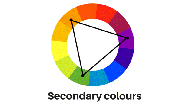
After knowing how many colours you will include in your palette, you are now tasked to pick them. Try to choose any colour that will successfully complement your primary colour to avoid clashing of colours on your website. Some sites are not even using other colours for their websites, but you would want a set of shades you would work with, instead of working with a monochromatic scheme.
If you think you are having a hard time, you can get help from different tools online. An example is using Adobe’s colour wheel tool, which can help in picking a colour scheme that is based on your primary colour.
Find your neutral colours
These colours are mostly not used in the background or other designs on your site. They are used as the colour of the texts and used to differentiate elements from the background colour. Most of the time, it is used for text, since texts that are based on secondary colours may give a hard time to your audiences.
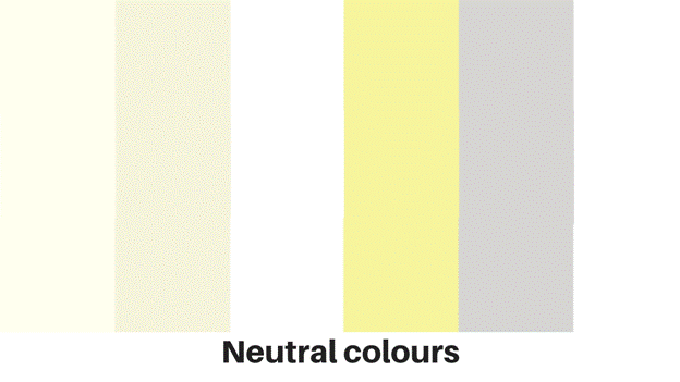
You may choose from white, black, grey, brown, and cream as neutral colours you can incorporate in your colour scheme. These colours neutralise everything to make your design a breathable one.
Applying your chosen website colour scheme
Lastly, you can now apply all the colours you have chosen for your site. The last problem might be where will you put these different colours on your website.
Primary colours are mainly the attention grabber of your site. You will incorporate this colour on where you would want your audience to look at or take action. This should be the colour of your CTA buttons, headings, icons, and other necessary information. Pair it with your secondary colours; you can make this the colour of your background.
Secondary colours should be added on the less critical information on the website. This should help accent the primary colour of your site. Lastly, neutral colours should be the colour of the body text. You can use neutral dark colours for texts for light backgrounds and vice-versa.
The success of your website design is getting a significant determinant from your colours. You need to carefully pick the right colours for your site to give a positive effect on your brand. You would not need a designer for this; you need to take note of everything we said in this article, and you are good to go.
About the Author
Kenneth Sytian is the CEO of Sytian Productions, one of the leading web design services company in the Philippines. He has been designing websites and developing web apps for more than a decade. He is considered one of the top influencers in web design and development.