

The fact of having a website that is not mobile optimized leads you to lose sales. According to the latest researches:
- There are over 1.2 billion people accessing websites using their mobile devices.
- Global mobile traffic nowadays is 30% of all internet traffic.
- 88% of people agree that having a mobile optimised website encourages them to make a purchase.
- More than 50% of shoppers research online before making a purchase.
- 30% will abandon a transaction if the website has a poor mobile experience.
Considering how important to have a mobile optimised website can be for everyone. It does not matter if you are selling services or just have a blog about cats.
If you take into account the latest data about mobile internet traffic, you will be even more surprised:
1. Mobile exceeds PC internet usage for first time in history. This happened in 2014.
2. There are currently 4 billion mobile phones in use globally.
3. Undeveloped countries access the internet mostly from their mobile devices because they are cheaper than laptop or a tablet.
4. 1/3 of daily users on Facebook are mobile.
5. ½ of daily users on Twitter are mobile.
Looking at these statistics, you probably will be very surprised at how many websites today are still not mobile-friendly.
What Are Consumers Doing on Mobile?
How do consumers use mobile devices to access the Web? According to Online Publishers Association/Frank N. Magid Associates:
- 99.5 percent access content/information.
- 63.1 access the Internet.
- 62.1 percent check email.
- 49.2 percent listen to music.
- 46 percent play games.
- 41.7 percent download and use apps.
- 15 percent make purchases.
- 15 percent read a book.
First, allow me to explain what a mobile friendly website is.
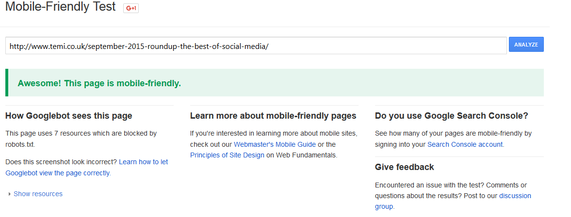
If you do not know if your website is displaying well as a mobile or not; go to this Google’s tool: https://www.google.co.uk/webmasters/tools/mobile-friendly/. It will show you how well your URL displays on each device: mobile, desktop and tablet. For example, if you run a test for my latest monthly roundup you will see the following:
Awesome! This page is mobile-friendly.
Results show that only 2%-10% of all websites worldwide were designed with mobile users in mind.
What I like about the Google mobile-friendly test tool is that it shows what must be improved if your website failed this test.
For example, this website meshcomputers.com (I lose it occasionally) is not mobile friendly

This tool tells you what must be changed to see “Awesome! This page is mobile-friendly.”
For this particular website the problems are:
- Text too small to read
- Links too close together
- Mobile viewport not set
- Content wider than screen
And here is how it looks on mobile device:

As you may see, Google is absolutely correct and it is almost impossible to access this site using mobile.
I’m sure that most users will leave this site immediately if they are using mobile.
How to Fix this Problem and Make your Website Mobile-Friendly
1. The first option is to create a separate mobile website on a subdomain or on a separate URL.
m.example.co.uk or example.co.uk/mobile
Big influencers like Rand Fishkin recommends to keep all content on a subdomain.
“I would still strongly urge folks to keep all content on a single subdomain. We recently were able to test this using a subdomain on Moz itself (when moving our beginner’s guide to SEO from guides.moz.com to the current URL http://moz.com/beginners-guide-to-seo). The results were astounding – rankings rose dramatically across the board for every keyword we tracked to the pages.
I’ve had the opportunity to see many dozens of other sites do the same, almost always with similarly positive results (assuming they’re moving from a subdomain without much other content/link signals to the subdomain that has those signals).”
To implement this:
- Create a subdomain.
- Make sure it has widely used URL; for example m.domain.co.uk or mobile.domain.co.uk.
- Take note of the FTP location where your new subdomain files go.
- Write a correct redirct to be sure that all people who visit your page example.co.uk/page1 from mobile will be redirected to m.example.co.uk/page1
- Set mobile viewport so all who access your website from a mobile will be redirected to the m.example.co.uk
Another good tutorial to consider – link.
2. Responsive Design. This method is widely implemented if you are using a CMS because, usually, custom responsive design are more expensive than just creating a mobile website on subdomain or on a folder.
For example, on WordPress almost all modern templates are mobile-friendly and our current template displays well on mobile, too. So, if you are using a WordPress, Joomla or other popular CMS; be sure to have mobile-friendly template.
What is mobile responsive design?
“When a website is responsive, the layout and/or content responds (or, adapts) based on the size of the screen it’s presented on.
A responsive website automatically changes to fit the device you’re reading it on. “
To implement this, you must optimize the layout of your content and adapt the content that is shown.
And here are very good infographic about mobile optimised website importance:

Infographic by- Invesp